 But I think this view is not correct. I think, rather, that we should put abstract labor time on the quantity (X) axis. The Y axis then represents the "hidden" utility. Our interpretation, then, changes from what is the marginal utility (price relative, c. p., to the prices of all other goods) of the q-th commodity (1,000,000th coat, 17th airliner, etc.) to the utility of the q-th labor hour devoted to the production of that commodity.
We can do this, I think, because the quantity of a commodity produced is a relatively simple function of the actual hours used to produce it. It might not be strictly linear — there are declining returns to scale — but it's still going to be monotonically increasing for the most part: the more hours we spending producing something, the more of that something we'll produce. It avoids a whole division step (hours to produce one commodity divided by hours to produce another) in creating production possibility frontiers and calculating opportunity cost.
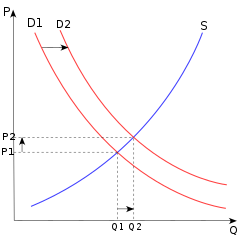
 The opportunity cost calculation becomes a lot easier now. The supply curve now has a very natural, obvious reason for sloping upward: For low quantities of labor used to produce some commodity, we are "stealing" labor time from the least valuable alternative commodities; as the quantity of labor increases, we must steal labor time from increasingly valuable alternatives. The macroeconomic interpretation, usually interpreted with real GDP on the X axis, then becomes directly a measure of employment; a recession is underemployment; inflation is (more-or-less) over-employment*; and optimal GDP is optimal, "full" employment**.
*Not too many people employed, but rather people employed making too many things that are unwanted.
**Note that modern economists' observation of "full" employment being between 4-5% includes structural, politically-motivated and -enforced unemployment of minorities and other marginalized groups. I'm coming to believe that the true Non-Accelerating Inflation Rate of Unemployment (NAIRU) is below 1%. In other words, a "5%" NAIRU is basically 0.5-1% unemployment among privileged groups (mostly white men) plus much higher political unemployment in other marginalized groups.
**Note that modern economists' observation of "full" employment being between 4-5% includes structural, politically-motivated and -enforced unemployment of minorities and other marginalized groups. I'm coming to believe that the true Non-Accelerating Inflation Rate of Unemployment (NAIRU) is below 1%. In other words, a "5%" NAIRU is basically 0.5-1% unemployment among privileged groups (mostly white men) plus much higher political unemployment in other marginalized groups.
No comments:
Post a Comment
Please pick a handle or moniker for your comment. It's much easier to address someone by a name or pseudonym than simply "hey you". I have the option of requiring a "hard" identity, but I don't want to turn that on... yet.
With few exceptions, I will not respond or reply to anonymous comments, and I may delete them. I keep a copy of all comments; if you want the text of your comment to repost with something vaguely resembling an identity, email me.
No spam, pr0n, commercial advertising, insanity, lies, repetition or off-topic comments. Creationists, Global Warming deniers, anti-vaxers, Randians, and Libertarians are automatically presumed to be idiots; Christians and Muslims might get the benefit of the doubt, if I'm in a good mood.
See the Debate Flowchart for some basic rules.
Sourced factual corrections are always published and acknowledged.
I will respond or not respond to comments as the mood takes me. See my latest comment policy for details. I am not a pseudonomous-American: my real name is Larry.
Comments may be moderated from time to time. When I do moderate comments, anonymous comments are far more likely to be rejected.
I've already answered some typical comments.
I have jqMath enabled for the blog. If you have a dollar sign (\$) in your comment, put a \\ in front of it: \\\$, unless you want to include a formula in your comment.
Note: Only a member of this blog may post a comment.